GOV DIGITAL
GovDigital — Redesigning Public Services
GovTech · Public Services
- Sector
- GovTech · Public Services
- Role
- Product Designer
- Duration
- 2025 · 2026
- Users
- Citizens, municipal staff and support teams
Public services are part of everyday life. Good design makes them easier to access, understand and trust.
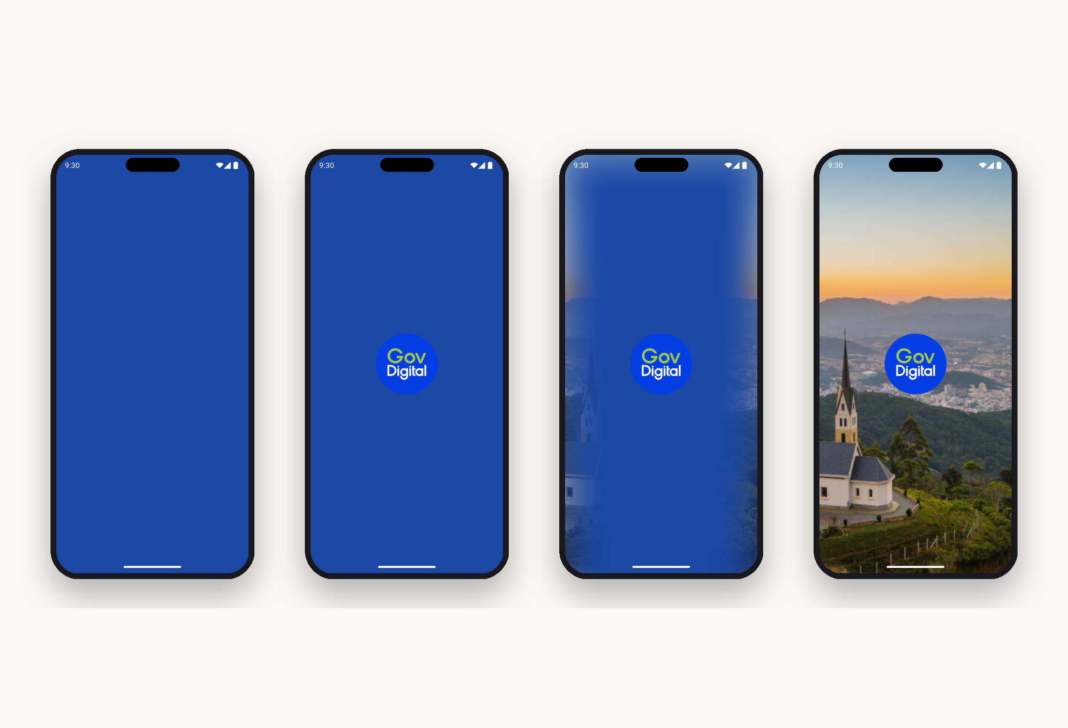
Splash screens and first explorations of the new app home.
One app, many services.
GovDigital brings together services that used to live scattered across dozens of municipal portals: customer service, scheduling, documents, events, and communication between citizen and city hall. The challenge was never just interface. It was turning administrative processes into journeys that actually make sense to people who never chose to be “users”.
I worked as Product Designer, responsible for the end-to-end design of six critical modules, from flow to technical documentation, always in close partnership with product, engineering and the municipal teams on the ground.
"The solution eliminated the need for in-person trips to the Sports Department."
Court booking — in short, the service represents an important advance in the municipality's digital transformation, promoting inclusion, transparency and ease of access to public policies in Votuporanga.
New modules, one shared language.
Each module was treated as a service in its own right. Mapped with stakeholders, prototyped, tested with real citizens, and refined until it became a pattern. Together, they form the backbone of the app.
App Access
Onboarding, gov.br authentication and account recovery. The first contact had to be trustworthy before it could be beautiful. Two step verification, clear error states, and fallbacks for anyone without biometrics.
Digital IDs
Municipal credentials (elderly, PWD, student, civil servant) unified in one place, with an offline verifiable QR code and syncing with the city's legacy systems.
My Requests
Service requests, protocols and history in a single flow. Status filters, document attachments, chat with the responsible department, and real visibility of what is happening. The opposite of the opaque counter.
Scheduling
Booking of in person services with choice of location, date and time. Availability rules per unit, reminders, and one tap cancellation. Drastically reduced no shows.
Circles
A system of roles and bonds: spouse, dependent, provider, caregiver. The same person can be invited into different circles with distinct permissions, solving the perennial problem of “who can speak on behalf of whom”.
Events Calendar
The city's public agenda: festivals, community drives, vaccinations, deadlines. Filters by neighborhood and category, opt in notifications, and native calendar integration.
Lazuli Gov design system.
With each new module, inconsistencies increased. Lazuli was born to bring alignment, scalability, and accessibility across the product.
Lazuli was the name chosen to represent the new Gov Design System, and it carries a symbolic story deeply aligned with the values we wanted to convey. The word comes from lapis lazuli, a deep blue semiprecious stone used across millennia by different civilizations as a symbol of wisdom, clarity, trust and inspiration.
Those meanings speak directly to the purpose of a Design System: to be a solid, trustworthy and clear foundation that unifies experiences, supports decisions, and inspires consistent, efficient products. Just as lapis lazuli once served as raw material to turn ideas into art, Lazuli exists to turn projects into coherent, accessible and scalable interfaces across Gov.
The name was chosen through a collaborative team vote, a mirror of the system's spirit: collective construction, alignment and shared purpose.
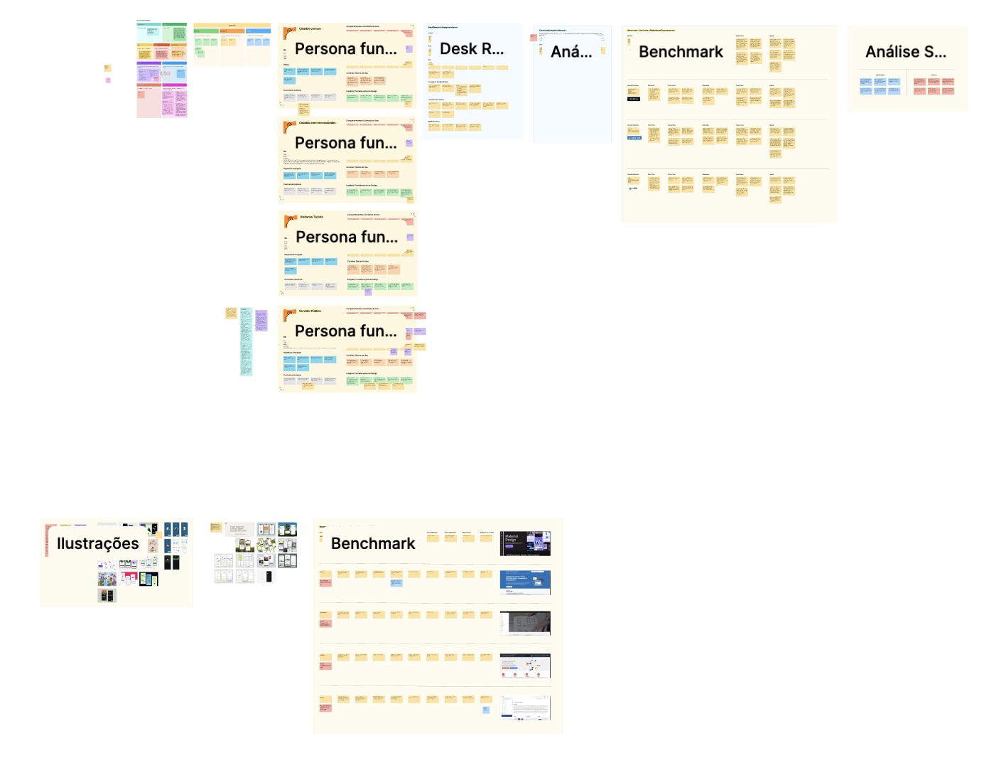
Tokens
A single semantic layer over Material foundations: color, spacing, typography, elevation. Contrast is applied at the token, not audited after the fact.
Components
A component core with usage rules, accessibility notes, and anti patterns collected from the field.
Governance
Monthly rituals, a proposal template, and a shared board with product. The system belongs to more people than just designers.
Documentation
Written for developers who don't like reading documentation. Short, opinionated, and versioned alongside the code.
Accessibility
WCAG 2.1 AA as a floor. Screen reader stories for every component. Contrast, focus and motion baked into the tokens.
Adoption
Rolled out across multiple Gov products. High component reuse, and design to dev handoff time cut in half.
What actually changed.
The most durable outcomes weren't screens. They were the shared vocabulary Lazuli gave to product and engineering, the discovery ritual that stayed in place after I left, and the shift in support tickets, from “how do I do this?” to “is this the right policy?”.
The real measure of success wasn't a dashboard number. It was seeing the same team that used to open tickets for every small change start to solve consistency questions on their own, using Lazuli as a reference.